A recent paper from New Philanthropy Capital revealed that affluent areas have more charitable wealth and resources than the most deprived. For anyone seeking to address deprivation or inequality, this is a big problem – the places that need the most support are in fact getting the least. In their report, NPC makes a strong case for improving strategic decision making to address this and basing decisions on data which show more than just economic or infrastructure inequalities.
But addressing this imbalance in resources isn’t straightforward, and neither is solving deprivation and inequality. The report from NPC prompted Power to Change to describe how they use data to understand their funding priorities – highlighting their use of the Index of Multiple Deprivation (IMD) as a high level guide of which areas are most in need. But Stephen Miller’s blog reiterates the challenge at the heart of NPC report – how can funders and policy makers recognise the different needs and strengths of different places?
This question is familiar to us at Centre for Thriving Places and it’s been one of the main instigators for developing the Thriving Places Index – a framework which measures the local conditions for wellbeing, and whether those conditions are being delivered fairly and sustainably.
In contrast to the IMD the Thriving Places Index takes an asset based approach, meaning that it doesn’t just look at what is missing, but measures the positive drivers of wellbeing. It helps identify places that are doing well at creating the conditions for wellbeing in addition to those that are not doing so well.
Sometimes this conflicts with the assumptions made about places which are deprived, showing that places that struggle in some areas are flourishing in others. At other times it paints a more complex picture of affluent areas – showing that the conditions for wellbeing may not be delivered either equitably or sustainably.
In September an update of the IMD was released and we’ve taken a look at the data alongside the TPI to see what the two datasets can tell us about the different approaches and how the TPI can support funders and key decision makers to focus on strengths as well as weaknesses.
Overall there is a strong positive correlation between deprivation measured by the IMD and local conditions measured by the TPI – so if a local authority scores well on local conditions on the TPI, it’s likely to be less deprived according to the IMD.
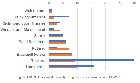
Illustrating this, the top ten highest scoring local authority areas in the local conditions headline element of the TPI largely correspond to the top 10 least deprived local authority areas:

Figure 1. Top 10 ranking local authorities on Local Conditions in the TPI 2019, compared to IMD 2019 rankings. IMD ranks are reversed so that 1 is the least deprived area.
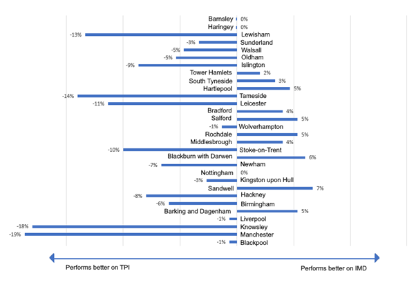
What’s more interesting is that there are some places that perform quite differently on the TPI and the IMD, likely because the TPI captures a wider range of indicators than the IMD does.

Figure 2. Percentage difference between IMD and Local Conditions ranks for the 30 (20%) most deprived areas.
An example of a place that ranks differently on the TPI than the IMD is the Wirral, which fares much better on Local Conditions on the TPI than it does on the IMD. Of the Local Conditions domains, the Wirral scores best on Local Environment and People and Community. The IMD doesn’t capture people and community and lacks some elements of local conditions, which explains why the Wirral scores better on the TPI than it does on the IMD.
An approach that aims to highlight the things that positively affect wellbeing (as well as those that negatively affect it) doesn’t necessarily disregard the very real needs of deprived communities. This is especially important given that local deprivation affects our wellbeing above and beyond our individual circumstances. The IMD offers an authoritative assessment of the level of deprivation across the UK and we use some of the indicators that form the IMD to assess local conditions in the Thriving Places Index.
However, the TPI’s asset-based approach provides a different way to make and support decisions – building on the strengths that a particular place already has, and are unique to it. Whilst the Wirral, as just one example, might match other areas in terms of levels of deprivation, it has a unique constellation of other interconnected issues which will impact how change can happen there.The TPI framework acknowledges these interconnections and sheds light on how interventions can build on what’s working well. As Stephen says in his blog for Power to Change, “no two areas are the same.That means the funding and support they need will also differ.”
Despite almost constant acknowledgements from politicians that geography matters – think of the frequent use of phrases such as “left-behind towns” and “the Northern powerhouse” – there’s a lot of room for improvement in practically applying the insights that datasets at geographies lower than the national level like the Thriving Places Index can give. We agree it’s time for local policy makers, funders and community actors to address the gauntlet thrown down by NPC and to start digging deeper into why geographic differences exist – and what the data says about how to change them for the better.
We’ll be releasing new data for the Thriving Places Index on March 18 2020 – make sure to sign up to our newsletter to be the first to know when the latest scores are released.
Notes:
The Index of Multiple Deprivation (IMD) is the official measure of relative deprivation in England and follows an established methodological framework in broadly defining deprivation to encompass a wide range of an individual’s living conditions. It’s calculated at the level of Lower-layer Super Output Area which is below local authority level and is sometimes referred to as a ‘neighbourhood’.
All neighbourhoods in England are then ranked according to their level of deprivation relative to that of other areas. High ranking LSOAs or neighbourhoods can be referred to as the ‘most deprived’ or as being ‘highly deprived’. The IMD is also published at local authority level, aggregating the neighbourhood scores.


Comments are closed.